这篇教程教你怎么用python绘制dotplot写得很实用,希望能帮到您。
一、前言R语言不少库都可以方便的画dotplot,但是低频使用R这么多年,我依旧觉得R不是一门真正的编程语言。目前,在python中绘制dotplot貌似没有很轻量、方便的库,因此工作之余写了这个python_dotplot包,方便自己也希望能够方便他人吧。
二、安装可以通过pypi快速安装: pip install python_dotplot 该package当然可能存在一定的bug,所以也会处于不断迭代的过程中,可以通过以下方式获得特定或最新版本 pip install python_dotplot --upgradepip install python_dotplot==0.0.1b1 如果通过--upgrade参数不能获得最新版本,国内镜像会有一定的延迟,可指定pypi官方源指定镜像: pip install -i https://pypi.python.org/pypi python_dotplot
三、模块导入import dotplotimport dotplot.utilsimport pandas as pd%config InlineBackend.figure_format = 'retina' # 如果你的电脑设备是视网膜屏,可指定该参数渲染jupyter图像,会超清晰,超好看 包的层级结构很简单,主要包括以下模块: dotplot ├── cmap.py # 自定义color map ├── core.py # 实现了Dotplot类,用于封装数据以及绘图 ├── hierarchical.py # 实现了层次聚类,用于支持dotplot行和列通过层次聚类进行自动排序 ├── __init__.py # 初始化模块 └── utils.py # 实用函数,目前是夹带私货,我自己用的预处理函数,也许对其他人也有用
四、数据准备我们首先需要准备一个数据,这里要求输入必须是一个tidy data格式的pandas Dataframe,简而言之,tidy data是指在该数据框中每一行是一个观测,每一列是一个属性,下面以示例数据为例: term_list = ['GO:0002455', 'GO:0006958', 'GO:0006956', 'GO:0038096','GO:0002673', 'GO:0051251', 'GO:0060333', 'GO:0006910','GO:0002483', 'GO:0002440', 'GO:0009141', 'GO:0009123', 'GO:0006119', 'GO:0009260', 'GO:0015985', 'GO:0015986', 'GO:0006260', 'GO:0044843', 'GO:0061621', 'GO:0061718']up = pd.read_csv('./example_data/group1.csv', header=0, index_col=0)down = pd.read_csv('./example_data/group2.csv', header=0, index_col=0)data = dotplot.utils.merge_clusterprofile_results(dataframes=(up, down), groups=['B6_up', 'B6_down'], term_list=term_list) | Description | GeneRatio | BgRatio | pvalue | p.adjust | qvalue | geneID | Count | group | | ID | | | | | | | | | | | GO:0002455 | humoral immune response mediated by circulatin... | 22/178 | 150/18670 | 19.365993 | 16.222197 | 16.298589 | HLA-DQB1/CD55/IGHM/PTPRC/TRBC2/IGHG2/IGKV3-20/... | 22 | B6_up | | GO:0006958 | complement activation, classical pathway | 20/178 | 137/18670 | 17.588789 | 14.989062 | 15.065454 | CD55/IGHM/TRBC2/IGHG2/IGKV3-20/IGHV4-34/IGHV3-... | 20 | B6_up | | GO:0006956 | complement activation | 20/178 | 175/18670 | 15.453684 | 13.008859 | 13.085251 | CD55/IGHM/TRBC2/IGHG2/IGKV3-20/IGHV4-34/IGHV3-... | 20 | B6_up | | GO:0038096 | Fc-gamma receptor signaling pathway involved i... | 18/178 | 139/18670 | 14.916693 | 12.675988 | 12.752379 | PTPRC/LYN/IGHG2/IGKV3-20/IGHV4-34/IGHV3-30/IGL... | 18 | B6_up | | GO:0002673 | regulation of acute inflammatory response | 18/178 | 159/18670 | 13.871614 | 11.817674 | 11.894066 | HLA-E/CD55/IGHG2/IGKV3-20/IGHV4-34/IGHV3-30/IG... | 18 | B6_up |
五、画图首先我们可以借助 DotPlot的类方法parse_from_tidy_data 对数据进行封装,然后直接调用plot函数进行绘图。当然,你也可以通过DotPlot的构造函数__init__()来实例化DotPlot对象。 new_keys = {'item_key': 'Description','group_key': 'group','sizes_key': 'Count'}dp = dotplot.DotPlot.parse_from_tidy_data(data, **new_keys)sct = dp.plot(size_factor=10, cmap='Reds') # 通过size_factor 调节图中点的大小
dp = dotplot.DotPlot.parse_from_tidy_data(data, item_key='Description', group_key='group', sizes_key='Count') # 该效果完全同上,这是python语言特性sct = dp.plot(size_factor=10, cmap='Reds') 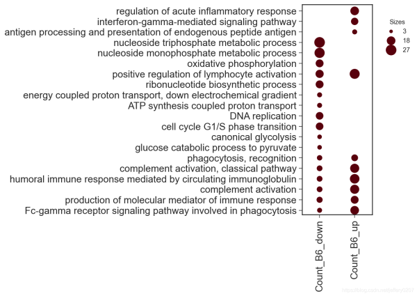
我们可以通过color_key指定data中的列做颜色映射。 new_keys = {'item_key': 'Description','group_key': 'group','sizes_key': 'Count','color_key': 'pvalue'}dp = dotplot.DotPlot.parse_from_tidy_data(data, **new_keys)sct = dp.plot(size_factor=10, cmap='Reds', cluster_row=True)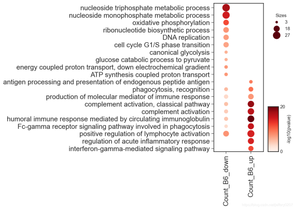
可以通过circle_key增加一列作为虚线圆圈的映射。 DEFAULT_CLUSTERPROFILE_KEYS = { 'item_key': 'Description', 'group_key': 'group', 'sizes_key': 'Count', 'color_key': 'pvalue', 'circle_key': 'qvalue'}dp = dotplot.DotPlot.parse_from_tidy_data(data, **DEFAULT_CLUSTERPROFILE_KEYS)sct = dp.plot(size_factor=10, cmap='Reds', cluster_row=True)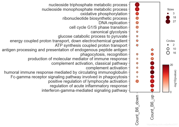
当然,更多的参数我们可以通过signature来查看,我对这些参数都做了类型注释,应该是通俗易懂的: Signature:dp.plot( size_factor:float=15, vmin:float=0, vmax:float=None, path:Union[os.PathLike, NoneType]=None, cmap:Union[str, matplotlib.colors.Colormap]='Reds', cluster_row:bool=False, cluster_col:bool=False, cluster_kws:Union[Dict, NoneType]=None, **kwargs,)Docstring::param size_factor: `size factor` * `value` for the actually representation of scatter size in the final figure:param vmin: `vmin` in `matplotlib.pyplot.scatter`:param vmax: `vmax` in `matplotlib.pyplot.scatter`:param path: path to save the figure:param cmap: color map supported by matplotlib:param kwargs: dot_title, circle_title, colorbar_title, dot_color, circle_color other kwargs are passed to `matplotlib.Axes.scatter`:param cluster_row, whether to cluster the row:param cluster_col, whether to cluster the col:param cluster_kws, key args for cluster, including `cluster_method`, `cluster_metric`, 'cluster_n':return: 因此,我们可以通过关键字参数修改图例中的部分组件: sct = dp.plot(size_factor=10, cmap='Reds', cluster_row=True,dot_title = 'Count', circle_title='-log10(qvalue)',colorbar_title = '-log10(pvalue)') 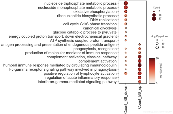
六、写在篇末dotplot在数据可视化中是一个强有力的展示方式,选择一个合适的可视化方式胜过千言万语 最后,最适合的可视化方式是最直观、最简洁的,不是炫技,别被花里胡哨的可视化所迷住双眼而忽略了信息的传达。 到此这篇关于教你怎么用python绘制dotplot的文章就介绍到这了,更多相关python绘制dotplot内容请搜索51zixue.net以前的文章或继续浏览下面的相关文章希望大家以后多多支持51zixue.net!
Django自定义User模型、认证、权限控制的操作
django 使用内置messages的操作 |


